01 - Logo Redesign
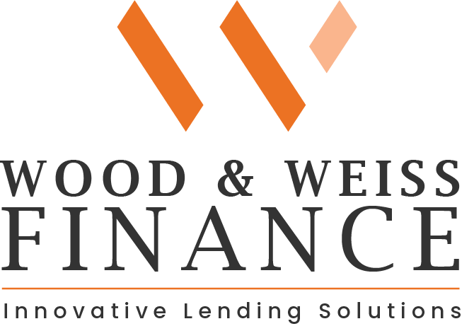
Wood & Weiss had been operating using a "homemade" logo for over a year, at this point in their journey they were ready to have something more professional that accurately represented themselves as a business.


Design Reasoning -
After an initial consult with the team at Wood & Weiss, I knew that something that needed to be reflected in their new logo was that Wood & Weiss pride themselves on being a small team that goes above and beyond for their clients.
With this in mind, their new logo mark depicts a W made of 3 pillars, two larger ones tilting left and a third, smaller and brighter pillar tilting right.
Where other, maybe bigger companies might go left, Wood & Weiss will go right.
02 - Social Media Templates
Wood & Weiss wanted templates that were bold and not too corporate feeling, conveying their professional yet light attitude.


Design Reasoning -
Wood & Weiss wanted something that would stand out from the corporate competition.
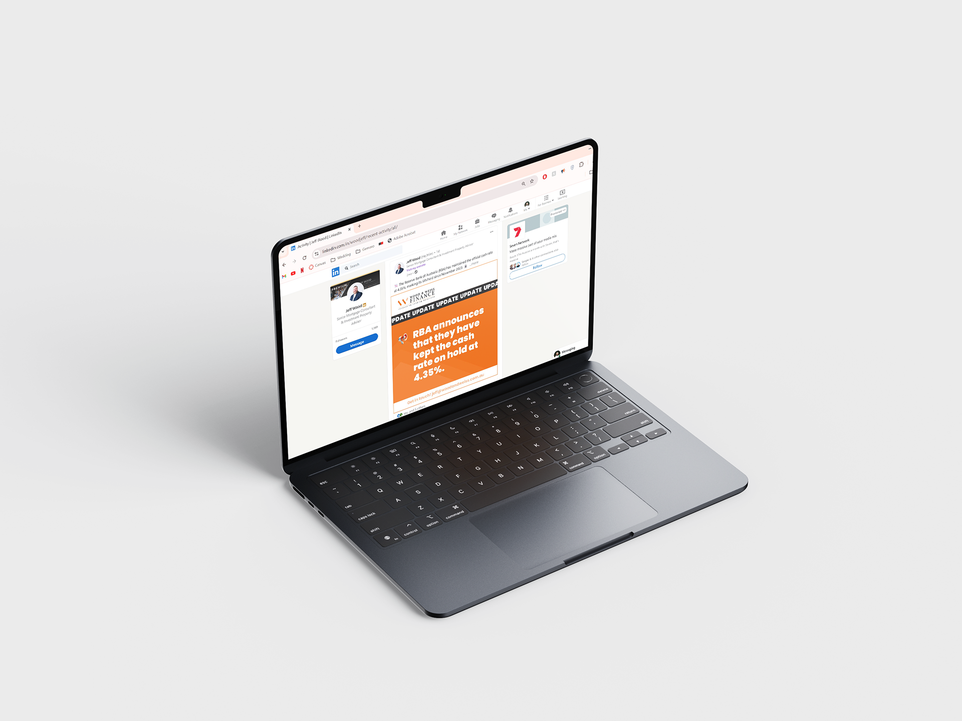
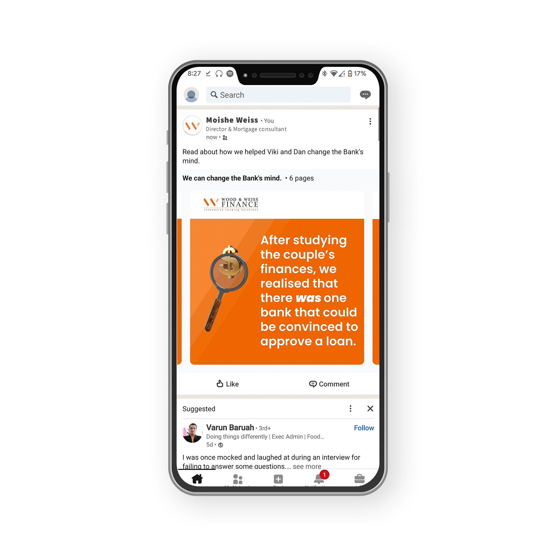
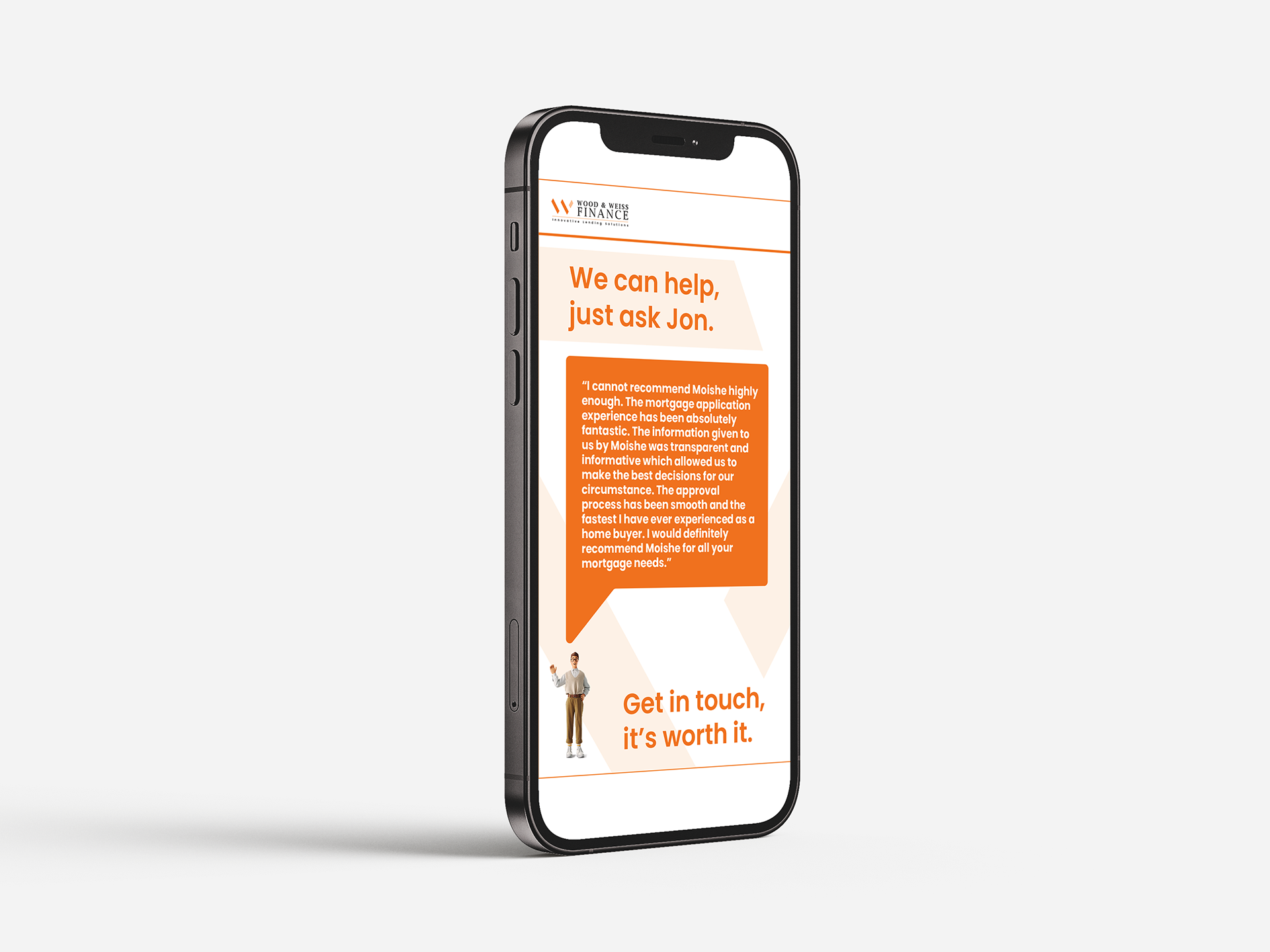
Utilising their brand's bold orange colour and modern 3d assets, I designed a suite of templates for Wood & Weiss to use, mainly on Linkedin.
The posts are easily edited by Wood & Weiss, as I set them up on canvas. All the team has to do it edit the text in each template and drag in the appropriate 3d assets (I supplied a large suite for them to choose from) and their posts are ready to go.
