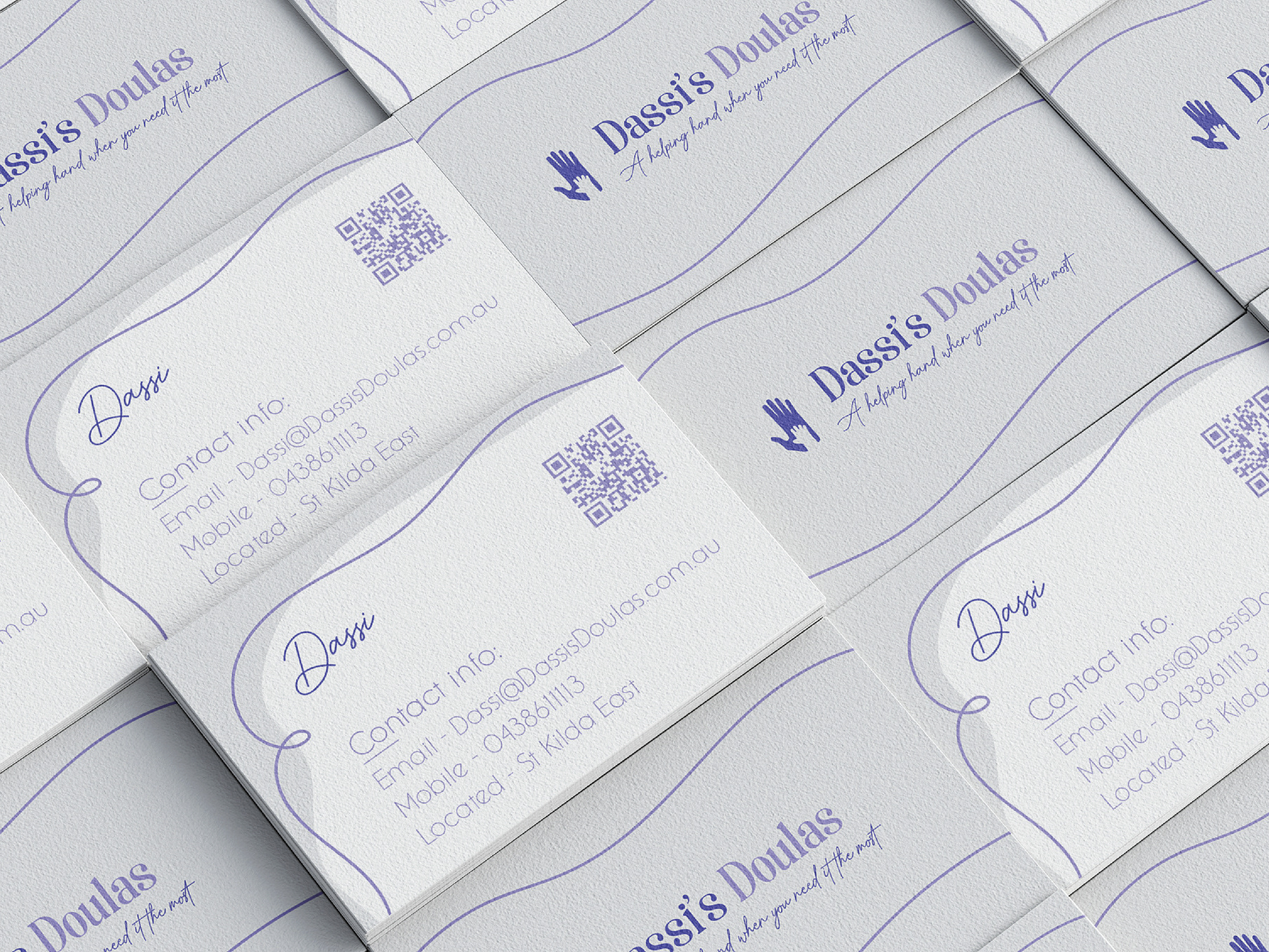
Visual Identity Package
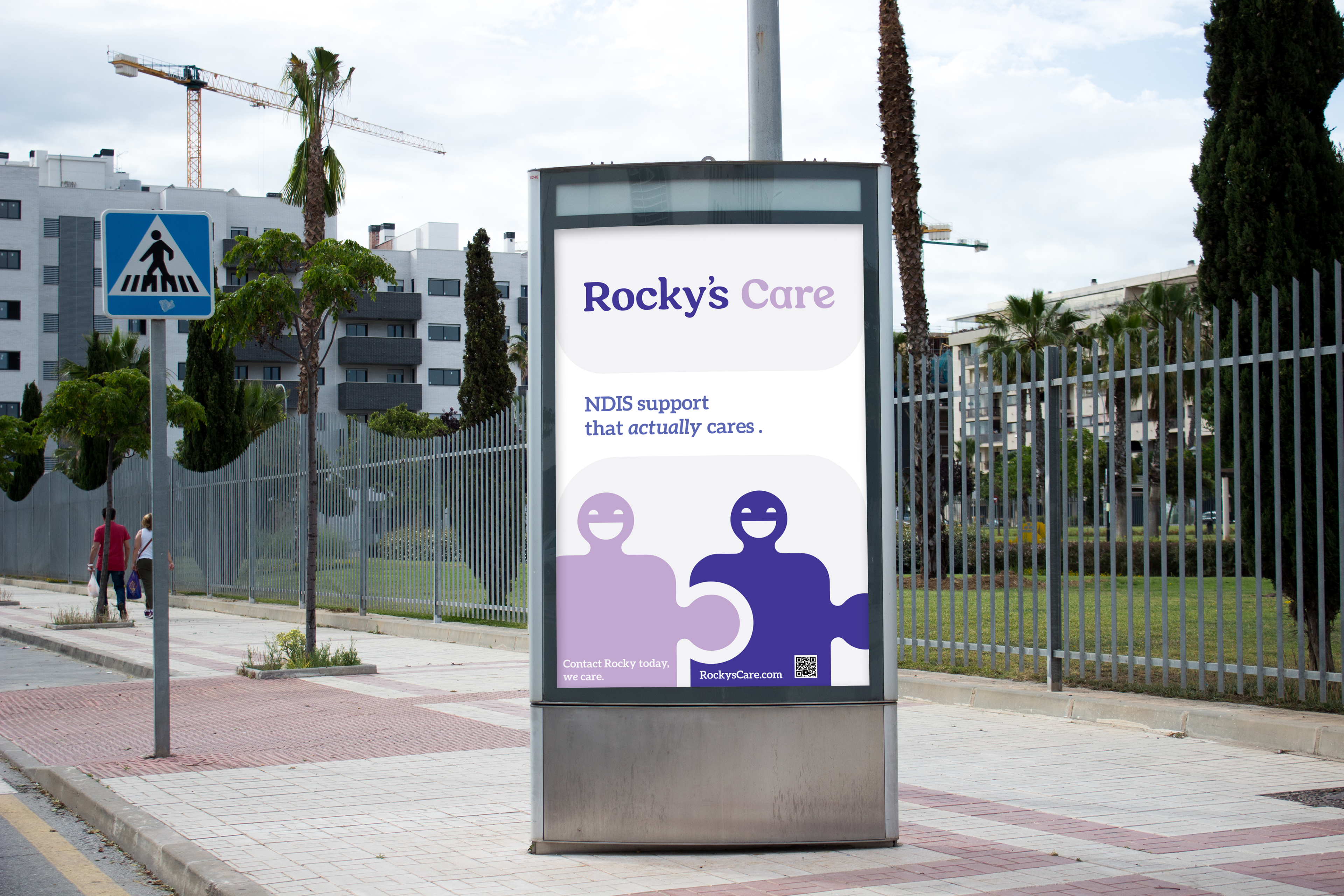
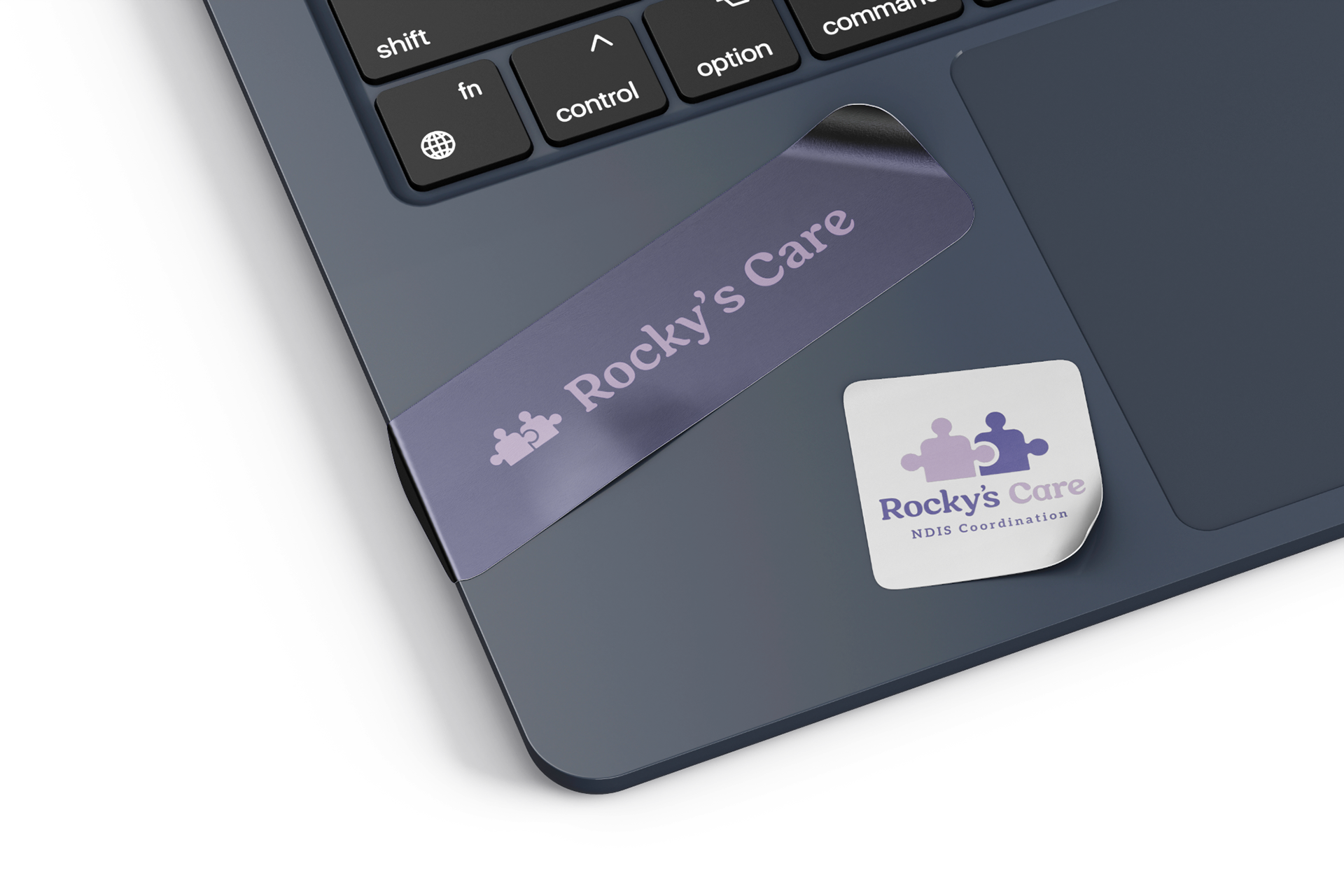
Rocky's Care wanted its visual identity to be approachable and fun, yet remain professional.
01 - Logo
Rocky's Care wanted their logo to represent their commitment to helping people with disabilities and being the missing piece that people have been looking for.


Design Reasoning -
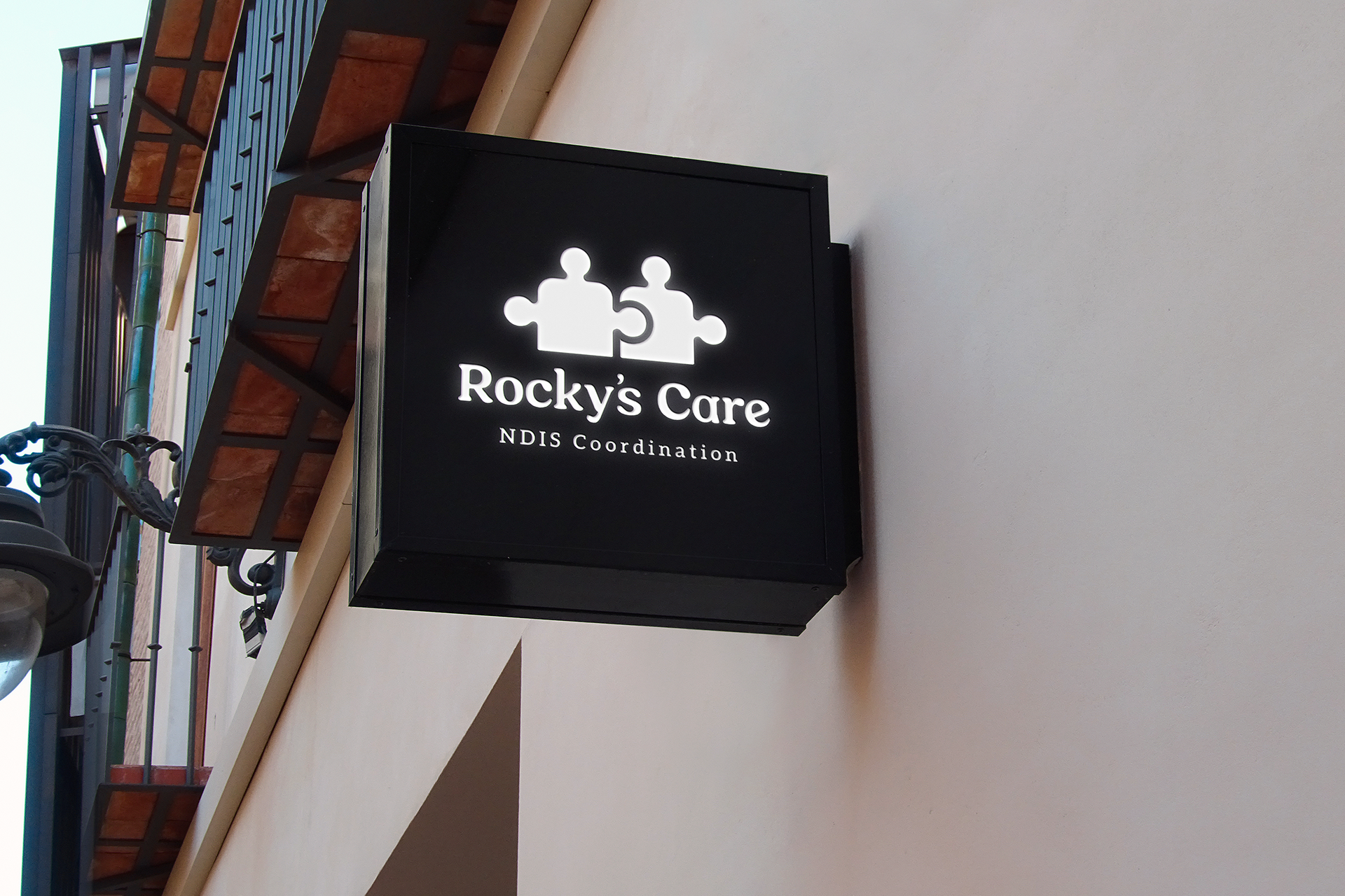
The logo’s pictorial component consists of two stylised, connected puzzle pieces. This is representative of multiple aspects of Rocky’s Care, such as helping connect people to proper care and the connection between Rocky and her clients.
02 - Brand Patterns
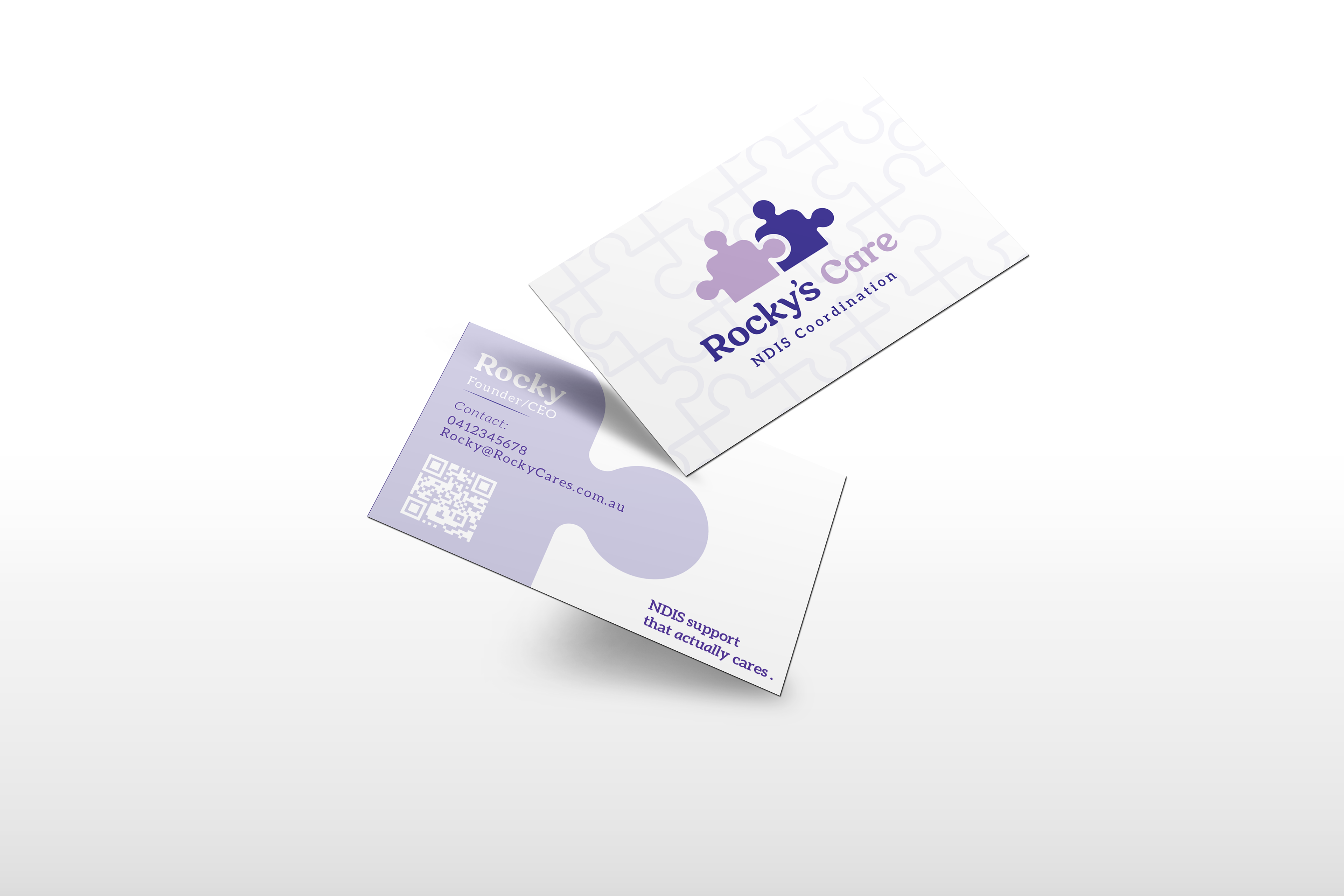
Rocky's Care's brand is heavily centered around puzzles, further evoking the sense of being the missing piece for their customers.
